IlluXCon's popularity continues to grow exponentially, and to such an extent that this coming year the exhibiting artists have been selected through a jury peer review. The judges were Jon Schindehette (AD for Dungeons & Dragons), Jeremy Jarvis (AD for Magic: the Gathering), Todd Lockwood, Robh Ruppel, and Donato Giancola.
I am happy to announce that I made the cut and will be attending alongside an impressive list of fellow artists.
Already looking forward to it.
Wednesday, 15 December 2010
Monday, 29 November 2010
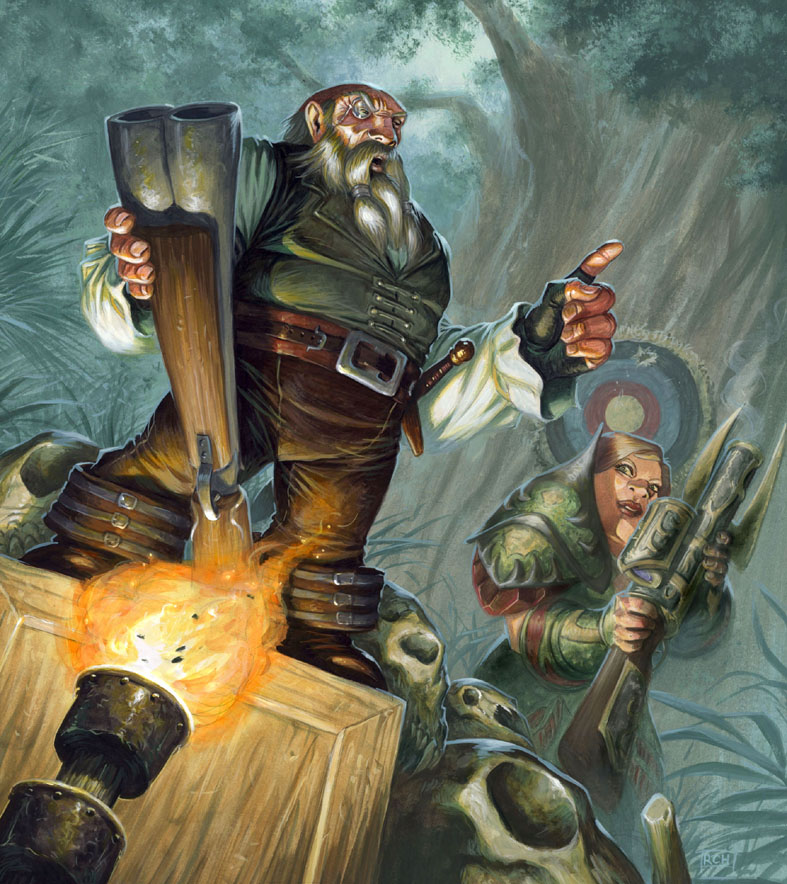
D&D ImagineFX

D&D Revisited:
Part of the ImagineFX article.
The Christmas issue of ImagineFX, No. 64, has a special article on the history of the art of Dungeons & Dragons. I was very happy to be asked to contribute to the article, and it is very gratifying to see myself arrayed alongside an amazing peer group of fantasy artists that have worked on D&D.
My passion for fantasy art was spurred on and inspired by playing D&D; to have seen those childhood dreams transform into a career still humbles me.
Wednesday, 24 November 2010
IlluXCon 2010 - A Review, or, I'm Back.

At My Stand.
Just over a week has passed since I returned from IlluXCon, and whilst the fatigue of the travel and socialising has faded, I still feel the absorption of the experience is only just beginning. In this review I am not going to try and list all the goings on, but rather give a narrow perspective based on my own approach to attending a show.
All credit should be given to Pat and Jeannie Wilshire for organising a unique convention. It was a thrilling experience to see so many fantasy artists gathered in such great number, and says something about the desire amongst us to participate in our community. A number of other shows provide artist's alleys, or art shows, but none other caters for us in such a direct and focused way. So often we work alone in our studios, and that can easily become somewhat isolating, so it's great to engage in such a direct way with other artists and their work.

A Panoramic View.
Prior to deciding whether or not to attend a show I attempt to assess it through three criteria:
Sales: Is the trip going to be profitable, or would I make more money staying at home?
Business: Am I going to reinforce and/or expand my existing client base?
Community: This is more nebulous, and is about connecting with my fellow artists, getting out of that aforementioned 'studio bubble', but also about being inspired, and learning from my peers' work.

The Centre Was A Great Space.
If I feel I can successfully tick two out of the three categories then I judge the show to be worthwhile. For this trip I already knew that a transatlantic journey with it's correpsonding overheads was a poor starting point to plan for this as a 'Sales' trip. However I was right to feel optimistic about the other criteria.
I can have had email correspondance with an art director for a number of years, and yet find that relationship improved immeasurably with a half hour chat. This show was no exception as I caught up with a number of clients I work for, oh, and it was very gratifying to be offered work from a new client I was wanting to meet even as I was still setting up my stand.

I had Some Interesting Neighbours:
Jordu Schell's Awesome Masks.
However the show scored biggest in my last category. Not only did I catch up with a lot of established friends, but also made some good new ones. There already exists a commonality between all the artists through the shared work we do, and it always feels very easy to build upon this. I was also impressed by the number of artists attending the show who weren't even exhibiting (primarily because of their digital backgrounds, in what is oestensibly a traditional art show), this goes back to what I said at the start of the blog.

On Both Sides:
Tom Taggart's Mantrap.
I also couldn't fail to be massively inspired, and motivated by the overwhelming quality, and diversity of the work on display. I was also gratified by the positive feedback I received on my own work; it is very informative to observe what aspects other artist's pick up on in one's work. In particular I was happy at the number of people who commented on my colour use, an area I hadn't necessarily thought of as one of my strongest qualities.
I had a very stimulating and engaging time at the show. I want to thank everyone who stopped by and said hi. I welcomed the fact that I had a proper opportunity to talk with those who did, but also to visit other artists at their stands and discuss their work and developments. I am already looking forward to next year!
Lastly I wanted to say thanks to Christopher Burdett for his help at the show, oh, and I lifted the first photo in this blog from his own , which give a much more thorough overview of the show, and which I recommend reading.
Wednesday, 3 November 2010
Illuxcon 2010
This time next week I will be on a plane speeding over the Atlantic as I head towards Illuxcon.
I hope to see many of you there.
I hope to see many of you there.
Wednesday, 27 October 2010
Fightback! -Dragon #392 Cover.

Fightback!
Acrylic, Approx 26" x 23"
©Wizards of the Coast
Original artwork for sale. £1500.
I had the great pleasure of working on the lastest Dragon magazine cover. A piece which had lots of fun elements to work with, but which also presented a challenge with the composition.
One of the key aspects I enjoy about illustration is the storytelling, and this brief had a compelling narrative. An Elf, battered and beaten, is cornered by a fearsome War Troll, when a Dwarf Cleric intervenes by throwing up a defensive ring of obsidian spikes, then fighting back with her earth's grasp power. Oh, and of course this needed to work in two formats, the full one above, and a second cropped version for use internally, as below.

The cropped value study.
I decided to emphasise the cornered predicament of our heroes by using the Troll as the framing device, and also to elevate our point of view. Looking down upon someone helps make them appear more vulnerable. Whilst placing the Troll in the foreground like this gives him that imposing mass and big silhouette.
The Trolls body and sword provide a neat triangular window through which to see our protagonists. I combined this with stronger 'spot' lighting upon them to really make the beleagured heroes our focus. The white Elf shield also aids in letting the Dwarf head stand out clearly. Important as she is the source of the action with her spell going off.
The earth's grasp presented the biggest challenge. An illustration is a 'frozen moment', yet the spell required some clarification, and a sense of movement. The Dwarf seizes a handful of dirt, throws it into the air, where it transforms into a grasping stone hand that grabs, and starts to crush, the Troll's face. The trailing dust cloud allowed me to cover both those bases. Plus the swirling 's-shape' is given energy by breaking the frame set up by the Troll, and is further emphasised by the contrasting, saturated, red of it's magical effect.
Initially this might give the impression of a final stand, but really it is just the start of the Fightback!
Tuesday, 12 October 2010
Portfolio Theft
I have been very saddened to learn that Scott Altmann had a portfolio of his work stolen from his booth at last weekend's New York Comic Con.I don't need to say what I think about this. Instead check out his blog
where he is beginning to post images from the stolen collection, if you see any of these pieces anywhere you know what to do.
where he is beginning to post images from the stolen collection, if you see any of these pieces anywhere you know what to do.
Friday, 1 October 2010
Rules Compendium - Focal Points.

Taunting Memory
Acrylic, Approx 16" x 22"
©Wizards of the Coast.
Original artwork for sale.
The Dungeons & Dragons supplement Rules Compendium has just been released, and I am very happy to have a couple of pieces in the book. Whilst showcasing them I am also going to discuss how I try to bring focus into my work.
Taunting Memory was great fun as for once it depicts a group of characters socialising after the fight. Usually I find myself showing a combat in progress, but this time we get to see how the Dark Elf behaved when faced with a Beholder - although I also like the fact you could interpret this as a prophecy of events yet to happen - either way he doesn't look too happy about the telling.
The viewers first attention is drawn to the Dark Elf by the strong contrast of his skin and hair. Something further reinforced by his clear profile and the framing element of the light coloured picture on the wall behind him. The row of heads helps keep our attention in the upper part of the picture, whilst various lines, the Elven staff, Dark Elf's sword and scroll case, Dwarf's arm and roof beams, help draw the eye towards the conjured memory. This in turn is more saturated than the surrounding elements, again, hopefully, getting our attention.

Healing Hand
Acrylic, Approx 16" x 12.5"
©Wizards of the Coast.
Original artwork for sale.
Healing Hand has another appearance from Falon (I'm getting quite familiar with this guy now), this time helping out Shara, who nearly bit off more than she could handle by taking on that Troll.
Shara's red clothing helps provide the colour contrast to make her and Falon the focal point, with the nice glowing hand provide the pinpoint. The softened, light. background, also helps pull our eye that way, whilst strengthening Shara's silhouette. It also allowed me to lose the edges around Falon, adding to the mystical feel.
Friday, 24 September 2010
Falon the Warpriest.

Alerted.
Acrylic, Approx 8.5" x 20"
Original Artwork For Sale
©Wizards of the Coast.
Wizards have just released the Heroes of the Fallen Lands, a player's essentials supplement. Not only did I create the cover artwork, depicting a new set of iconic D&D characters, but I had the pleasure of portraying one of them, Falon the Warpriest, inside as well.
I didn't design the concept for the character, but when you get to work with an iconic they do get moulded a little bit towards your own sensibilities, and a sense of part ownership accrues. At the very least he acquired an extra pouch and potion bottle.
With the two internals I added a little narrative that hadn't initially been asked for; so that above we have a lone single character shot, but one that directly relates to the piece below...
...this is what happened next:

Duel
Acrylic, Approx 16" x 21"
Original Artwork For Sale
©Wizards of the Coast.
Making those additional connections and being able to add that little bit more is always very satisfying.
Here is the cover artwork, which was shown in a previous blog post.

Heroes Of The Fallen Lands
Acrylic, Approx 16" x 21"
Original Artwork For Sale
©Wizards of the Coast
Wednesday, 15 September 2010
World of Warcraft
It is a little while since I have shared any World of Warcraft work, and as a new set of cards for the trading card game has just been released now would seem an ideal time to catch-up.
 Hemet Nesingwary
Acrylic; original for sale.
© Blizzard Entertainment.
 Skeletal Warhorse
Acrylic; original for sale.
© Blizzard Entertainment.
 Swift Palomino
Acrylic; original for sale.
© Blizzard Entertainment.
 Branthea The Resolute
Acrylic; original for sale.
© Blizzard Entertainment.
 Explosive Flames
Acrylic; original for sale.
© Blizzard Entertainment.
Acrylic; original for sale.
© Blizzard Entertainment.

Acrylic; original for sale.
© Blizzard Entertainment.

Acrylic; original for sale.
© Blizzard Entertainment.

Acrylic; original for sale.
© Blizzard Entertainment.

Acrylic; original for sale.
© Blizzard Entertainment.
Tuesday, 7 September 2010
Red Box

Enter The Lair
Acrylic, Approx 19" x 19"
Original Artwork For Sale
©Wizards of the Coast.
The 'Red Box' holds a legendary place in Dungeons & Dragons lore. It was one of the original introductory starter packs, featuring iconic artwork by Larry Elmore, and was a portal through which many gamers entered the hobby.
You can imagine how thrilled I was to hear that Wizards of the Coast were going to revisit that product, and that they would like me to do likewise with the artwork. The look of the D&D red dragon has changed in the intervening period, as has the appearance of the heroes, but I wanted to capture the feel of the original, and pay homage in my own way.

This is the original, and now current as well, version of the box, as presented on Wizards' web site.

Here you can see my artwork being used on the rules manuals.
This project was a great thrill to work on, albeit challenging to homage such a famous painting, and I take great pleasure to think my own work will be an instrumental part in the next generation of players gaming experience.
Wednesday, 1 September 2010
Fantasy+
I was very happy to be selected for inclusion in a newly released artbook; Fantasy +, The Best Hand-Painted Illustrations.

It is a celebration of fantasy artists who work traditionally, and being included amongst the twenty contributors was great. It is a nicely produced, full colour, publication, with each artist having 10 pages to showcase their work, alongside which we provide insights into each piece.
The other illustrators featured within this 200 page book are: Donato Giancola, Don Maitz, Volkan Baga, Brian Despain, Eric Fortune, Lucas Graciano, Petar Meseldzija, Peter Ferguson, Raul Cruz, Ron Spears, Shaun Tan, Steven Belledin, Tom Fowler, Eric Joyner, Ciruelo Cabral, Therese Nielsen, Greg Staples, Adrian Smith and Daren Bader.
Find out more here.
Tuesday, 20 July 2010
The Sacred Pool

Acrylic, approx 12" x 17".
Original artwork for sale.
© Fantasy Flight Games/Games Workshop.
Fantasy Flight Games have just announced the release of the latest Talisman boardgame supplement The Sacred Pool , which in turn means that I can now share my cover artwork.
The image follows a similar format to The Reaper and The Frostmarch, featuring a strong central figure, with three heroes in the foreground. However this time we have a 'goodie' as the main character, and a full scene, rather than a movie poster-style collage.
I have enjoyed working on the whole Talisman series, it is always great to be associated with one particular product, especially when it is painting the covers. This is one of my favourites so far, maybe because it was a slight change of pace to do something 'softer'.
I have enjoyed working on the whole Talisman series, it is always great to be associated with one particular product, especially when it is painting the covers. This is one of my favourites so far, maybe because it was a slight change of pace to do something 'softer'.
Tuesday, 13 July 2010
One Good, Two Better! - the Cloneforge process.
My second component card in the Doomsday Machine was Ignite The Cloneforge and I also took photographs of this painting as it progressed. Here follows a walkthrough of my painting process.

Masked and Washed.
My first step was to mask off the Cloneforge with some masking film. This meant that I could get some nice big loose brushstrokes onto the background without worrying about the integrity of this part of the image. I loosely applied a wash across the whole page in a blue/grey tone. This helps give a base underpainting to work into and fixes the graphite.

The Background.
I had already decided that the Dragons would be Red and Blue, and therefore opted for a complimentary indigo-ish shade for the background. However the colour was deliberately desaturated, and the contrast very low, so that the focal elements would stand out clearly against the background. I also faded the elements out towards the bottom of the image. The lack of clutter would help the wires and cables I would be painting there to read clearly, plus it helped create the sense of a large space.

Foreground Elements.
As with the background I painted the foreground cogs and gears with low contrast, and deliberately looser marks. Again this would help keep the focus where I wanted it; tighter rendering and high contrast help attract the eye. I also opted for dark values to seperate these elements very strongly from the background. Although the Cloneforge has no rendering at all yet it is already crying out to occupy that middle ground.

Mapping Out
The foreground has had some highlights added. it needed a little bit more attention than the background, and this has also helped define the features somewhat.
I have then made first pass on the Cloneforge. Red and Blue for the Dragons ties them in with the overall background colour scheme, but also gives them huge contrast with each other. The brass of the device itself then contrasts nicely with all the surrounding elements.
As with the first wash at the start of the painting this pass fixes the graphite, and provides a basic layer to paint into.It also allows me to see the colours clearly mapped out. At this point if I didn't like the interaction of these colours I could make chnages. Later on it would become a lot harder.

Dragon Cloned.
The Dragons have been rendered, and I am beginning to make inroads on the Cloneforge itself. The colours appear quite saturated in contrast to the fore/background elements, and this aids their readability.

Cloneforged
The Cloneforge is nearly finsihed, and the additional cables have been painted in. The latter deliberately fan out in all directions, helping place the Cloneforge in it's own space. The details are tightly rendered, and the contrast between them and the foreground features is very noticeable.

Completed.
Finally I add in the walkway. This is almost a silhouette with the same colour scheme as the rest of the foreground. It helps add further depth and scale, especially when one picks out the figure at the control panel.

Scanned, Tweaked And Approved.
Acrylic. Approx 14" x 19.5"© Wizards of the Coast.
Monday, 5 July 2010
How it came together
Whilst painting 'The Pieces Are Coming together' I took a number of photographs of my process. I am presenting them here in chronological order.
As is usual for me I worked from back to front, with the strongest highlights, from the magical effect, being added last.


The Pieces Are Coming Together
Acrylic. Approx 14" x 19.5"
Original Artwork for Sale: £500
© Wizards of the Coast.
As is usual for me I worked from back to front, with the strongest highlights, from the magical effect, being added last.


Acrylic. Approx 14" x 19.5"
Original Artwork for Sale: £500
© Wizards of the Coast.
Friday, 2 July 2010
Doomsday Machine

The Pieces Are Coming Together
Acrylic. Approx 14" x 19.5"
© Wizards of the Coast.
Wizards have recently published a new set of Magic cards that follow an unusual design. These are the 'Archenemy' decks, and their unusual quality comes both from their oversized nature (these are BIG cards), and that in play several players gang up in an attempt to defeat the one Archenemy.
I had the pleasure of working on two cards; Ignite The Clonotron and The Pieces Are Coming Together. These both feature in the deck Assemble The Doomsday Machine and depict magical machinery of awesome scale and ability.

Ignite The Clonotron
Acrylic. Approx 14" x 19.5"
© Wizards of the Coast.
The designs have a further distinction from normal Magic cards as the explanatory text box is semi opaque. This meant the image needed to fill the entire card space, thus the portrait, rather than landscape, aspect, whilst ensuring the image would still read clearly. This explains why the focus is weighted heavily to the top part of the illustration.
Tuesday, 15 June 2010
Spirit Summoner - A Walkthrough

Spirit Summoner
Monster manual III - chapter start artwork.
Dungeons & Dragons. ©Wizards of the Coast
Acrylic, Approx 21" x 19".
Original Artwork for sale; £1200
The Monster Manual III has now hit the stores and I can share the Gnoll Spirit Summoner I created for the book.
I really wanted the central, shaman-like, figure and the spirits to stand out in this image. To that end I chose warmer less saturated colours for the background, which was rendered with softer edges and lower contrast than the foreground. The latter has tight definition and saturated cooler colours with higher contrast. The difference between these two approaches is what helps keep the image clear and readable.The following is a walkthrough showing how I arrived at this final point.

The Line Sketch
My starting point is a line sketch done with graphite onto board. I like to resolve a lot of the aspects of the image at this stage, and subsequently create a tight render.
About a third of the way in from the left you can see a faint vertical guide line that marks where the guttering will fall on this double-page spread.

My Working Space
Here you can see my set up. The painting is mounted onto the drawing board, with palettes and reference in place. Note the helmets tucked away at the back right. The nearest being sat on a floor standing speaker - music always helps.

The First Pass
I always favour working from back to front, with the focal elements usually rendered last. This is no exception, and you can see that I have painted in most of the background and am moving onto the foreground.
I have also loosely blocked in the ghosts. As I want them to have softer edges, and fade into the image, it is easier to do that if I introduce them from the beginning. This prevents me painting up to them and inadvertently creating an unwanted edge.
The central figure has been masked off which enables me to paint with big loose strokes over and around him without worrying about dirtying him up.

Terrain Completed
Most of the fore and background elements have been completed. I also softened the orange somewhat and brought in a touch more green. This helps lower the saturation and gives some greater contrast for the flames to work against.

Unmasked
The Gnoll has had the masking film removed, and you get the sudden glare of white paper, but also those nicely kept crisp edges.

Mapping In
Before going into a full render I like to map in the basic colours with a dilute wash. I did the same with the background when I started. This helps confirm the colour choices I have already made, because if I did dislike them now would the easiest time to make changes.

Dressing Up
I approach elements within the picture much as I do the whole, back to front, or in the case of figures inner layer to outer. This means that items which would overlap something else are painted later. Much easier and more flexible than painting up to the edge of something. At this point I have completed the fur/flesh and mapped out where the glowing magical light will fall.

Fully Clothed
Continuing on the figure is completed. During the process I might well revisit areas to check the whole ties together. This might mean redoing shadows on the fur, or darkening areas of the body to make sure the overall effect is consistent. I might paint elements seperately but I will rework any of them to make sure it pulls together as a whole. This can often include throwing in non-local colour in the shadows or highlights to help with the unification.

Spirits Begin To Emerge
I feel like I am on the home straight as I move onto the last figures. Though I naturally worked my way through the spirit figures, one at a time, I didn't try to bring any of them fully to completion at this point. I knew that it would be necessary to have another pass to get the values right throughout them, and I certainly didn't want to get too dark at this stage.
Working with acrylics it is a lot easier to darken an image, rather than lighten it. That is especially true when you are working with dilute washes, as I was with the spirits, as opposed to a more opaque finish, like the Gnoll.

The End
The Hyena spirit on the bottom left demonstrates that final revisit across the painting. The blue has been tweaked and the value range extended both ways, lighter and darker.
This is true of the whole painting. A last pass across the whole painting is very important. I don't want to create a disjointed piecemeal painting, and it can be too easy to focus on individual elemenst whilst neglecting the whole.
Of course this is not truly the end. I now needed to scan the image, make colour corrections, then decided any digital tweaks. In this case I upped the saturation on the Spirits and dodged some highlights to get some more intensity into them.
Subscribe to:
Posts (Atom)