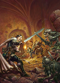
The Cropped Cover
I was very happy to be entrusted with a forthcoming pair of Dungeons & Dragons covers for the Player's Essentials titles. The First to be released will be Heroes of the Fallen Lands.
The painting shows the adventurers descending deeper into the depths of a dungeon, when they spot some Hobgoblin skeletons ahead, just as the Goblin skeletons attack from behind.
The Line Sketch
The dynamic tilted horizon line, and view down the stairs, help add drama to the image. It was my first opportunity to work with the new set of iconics, and I also enjoyed getting to draw Goblin skeletons.
The Final Cover
It is interesting for me to see the final image set within it's trade dress, and the product details can be found here:
The Uncropped Original Painting.
21.5" x 16.5", Acrylic, For Sale: £ 1700
I always work with a lot of bleed, and it gives the graphic designer a lot more flexibility on their crop and placement.


The perspective/angle is a bit confusing, but the composition itself is good as usual.
ReplyDeleteI like how you switched the more common warm/cold colours to cold/warm for the foreground/background! The lit background looks interesting and the cold tones make the skeletons look especially dead. The warrior seems powerful and I LOVE the fact he's wearing a padded shirt under his maille. :)
Also that rope across his chest! :D Your attention to character kit again.
Overall - a very nice cover.
I think you should take a riding crop to the graphic designer and make him bleed for covering up so much of your work!
ReplyDeleteJan: I have been told this will be the first appearance in print of the new iconics, so I can take little credit for the basic character designs, but I did add the extra bits of kit. I like to think what my own characters always seemed to have on them.
ReplyDeleteHowever I do always try to put a gambeson on my armour wearing figures - chainmail over a flimsy shirt won't offer a lot of protection :)
Gordon: I knew that the image was going to be cropped in on like this, which is why all the figures are in the central band, but I was aksed to provide an image covering the full cover space. This is what I was expecting. That is not t osay that on occasion a designer will crop an image differently to my expectations, or make other tweaks, but that is the nature of the job.
Another top image, how long did you spend on this Ralph? I think the cover work well even with the design elements all over it, job done!
ReplyDelete