Wednesday, 15 September 2010

World of Warcraft

It is a little while since I have shared any World of Warcraft work, and as a new set of cards for the trading card game has just been released now would seem an ideal time to catch-up.

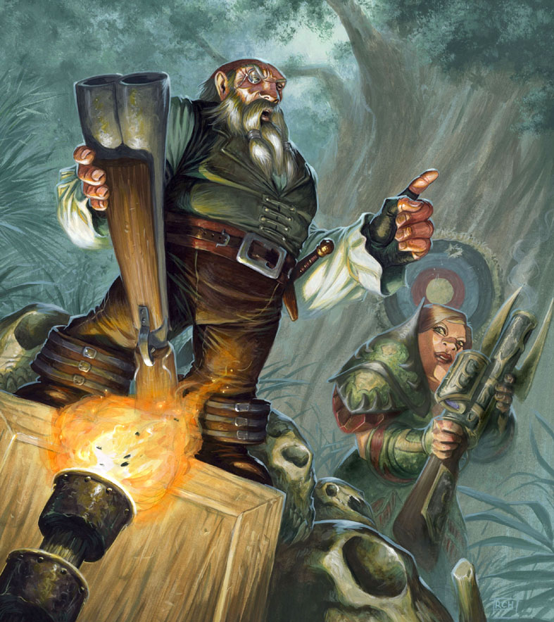
Hemet Nesingwary
Acrylic; original for sale.
© Blizzard Entertainment.

Skeletal Warhorse
Acrylic; original for sale.
© Blizzard Entertainment.


Swift Palomino

Acrylic; original for sale.
© Blizzard Entertainment.

Branthea The Resolute

Acrylic; original for sale.
© Blizzard Entertainment.

Explosive Flames

Acrylic; original for sale.
© Blizzard Entertainment.


Tuesday, 7 September 2010

Red Box

Enter The Lair
Acrylic, Approx 19" x 19"
Original Artwork For Sale
©Wizards of the Coast.

The 'Red Box' holds a legendary place in Dungeons & Dragons lore. It was one of the original introductory starter packs, featuring iconic artwork by Larry Elmore, and  was a portal through which many gamers entered the hobby.

You can imagine how thrilled I was to hear that Wizards of the Coast were going to revisit that product, and that they would like me to do likewise with the artwork. The look of the D&D red dragon has changed in the intervening period, as has the appearance of the heroes, but I wanted to capture the feel of the original, and pay homage in my own way.


This is the original, and now current as well, version of the box, as presented on Wizards' web site.


Here you can see my artwork being used on the rules manuals.

This project was a great thrill to work on, albeit challenging to homage such a famous painting, and I take great pleasure to think my own work will be an instrumental part in the next generation of players gaming experience.

Wednesday, 1 September 2010

Fantasy+

I was very happy to be selected for inclusion in a newly released artbook; Fantasy +, The Best Hand-Painted Illustrations.


It is a celebration of fantasy artists who work traditionally, and being included amongst the twenty contributors was great. It is a nicely produced, full colour, publication, with each artist having 10 pages to showcase their work, alongside which we provide insights into each piece.

The other illustrators featured within this 200 page book are: Donato Giancola, Don Maitz, Volkan Baga, Brian Despain, Eric Fortune, Lucas Graciano, Petar Meseldzija, Peter Ferguson, Raul Cruz, Ron Spears, Shaun Tan, Steven Belledin, Tom Fowler, Eric Joyner, Ciruelo Cabral, Therese Nielsen, Greg Staples, Adrian Smith and Daren Bader.

Find out more here.

Tuesday, 20 July 2010

The Sacred Pool

The Sacred Pool
Acrylic, approx 12" x 17".
Original artwork for sale.
© Fantasy Flight Games/Games Workshop.

Fantasy Flight Games have just announced the release of the latest Talisman boardgame supplement The Sacred Pool , which in turn means that I can now share my cover artwork.

The image follows a similar format to The Reaper and The Frostmarch, featuring a strong central figure, with three heroes in the foreground. However this time we have a 'goodie' as the main character, and a full scene, rather than a movie poster-style collage.

I have enjoyed working on the whole Talisman series, it is always great to be associated with one particular product, especially when it is painting the covers. This is one of my favourites so far, maybe because it was a slight change of pace to do something 'softer'.

Tuesday, 13 July 2010

One Good, Two Better! - the Cloneforge process.

My second component card in the Doomsday Machine was Ignite The Cloneforge and I also took photographs of this painting as it progressed. Here follows a walkthrough of my painting process.

Masked and Washed.

My first step was to mask off the Cloneforge with some masking film. This meant that I could get some nice big loose brushstrokes onto the background without worrying about the integrity of this part of the image. I loosely applied a wash across the whole page in a blue/grey tone. This helps give a base underpainting to work into and fixes the graphite.

The Background.

I had already decided that the Dragons would be Red and Blue, and therefore opted for a complimentary indigo-ish shade for the background. However the colour was deliberately desaturated, and the contrast very low, so that the focal elements would stand out clearly against the background. I also faded the elements out towards the bottom of the image. The lack of clutter would help the wires and cables I would be painting there to read clearly, plus it helped create the sense of a large space.

Foreground Elements.

As with the background I painted the foreground cogs and gears with low contrast, and deliberately looser marks. Again this would help keep the focus where I wanted it; tighter rendering and high contrast help attract the eye. I also opted for dark values to seperate these elements very strongly from the background. Although the Cloneforge has no rendering at all yet it is already crying out to occupy that middle ground.

Mapping Out

The foreground has had some highlights added. it needed a little bit more attention than the background, and this has also helped define the features somewhat.

I have then made first pass on the Cloneforge. Red and Blue for the Dragons ties them in with the overall background colour scheme, but also gives them huge contrast with each other. The brass of the device itself then contrasts nicely with all the surrounding elements.

As with the first wash at the start of the painting this pass fixes the graphite, and provides a basic layer to paint into.It also allows me to see the colours clearly mapped out. At this point if I didn't like the interaction of these colours I could  make chnages. Later on it would become a lot harder.

Dragon Cloned.

The Dragons have been rendered, and I am beginning to make inroads on the Cloneforge itself. The colours appear quite saturated in contrast to the fore/background elements, and this aids their readability.

Cloneforged

The Cloneforge is nearly finsihed, and the additional cables have been painted in. The latter deliberately fan out in all directions, helping place the Cloneforge in it's own space. The details are tightly rendered, and the contrast between them and the foreground features is very noticeable.

Completed.

Finally I add in the walkway. This is almost a silhouette with the same colour scheme as the rest of the foreground. It helps add further depth and scale, especially when one picks out the figure at the control panel.

Scanned, Tweaked And Approved.

Acrylic. Approx 14" x 19.5"© Wizards of the Coast.
Monday, 5 July 2010

How it came together

Whilst painting 'The Pieces Are Coming together' I took a number of photographs of my process. I am presenting them here in chronological order.

As is usual for me I worked from back to front, with the strongest highlights, from the magical effect, being added last.


The Pieces Are Coming Together


Acrylic. Approx 14" x 19.5"
Original Artwork for Sale: £500
© Wizards of the Coast.

Friday, 2 July 2010

Doomsday Machine

The Pieces Are Coming Together
Acrylic. Approx 14" x 19.5"
© Wizards of the Coast.

Wizards have recently published a new set of Magic cards that follow an unusual design. These are the 'Archenemy' decks, and their unusual quality comes both from their oversized nature (these are BIG cards), and that in play several players gang up in an attempt to defeat the one Archenemy.
I had the pleasure of working on two cards; Ignite The Clonotron and The Pieces Are Coming Together. These both feature in the deck Assemble The Doomsday Machine and depict magical machinery of awesome scale and ability.

Ignite The Clonotron
Acrylic. Approx 14" x 19.5"
© Wizards of the Coast.

The designs have a further distinction from normal Magic cards as the explanatory text box is semi opaque. This meant the image needed to fill the entire card space, thus the portrait, rather than landscape, aspect, whilst ensuring the image would still read clearly. This explains why the focus is weighted heavily to the top part of the illustration.